Google Maps on iOS, Android and the web is getting a new and cleaner look with a more subtle color scheme.
Finding your way around the world using your smartphone just got a whole lot better-looking after Google revealed a big redesign of its mapping service.
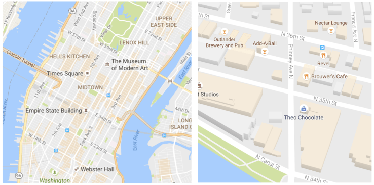
The idea behind the new look for the maps is to remove clutter. As Google notes, its goal was to balance information without overcrowding maps, so its removing elements “that aren’t absolutely required.”. The team removed road outlines, for example, and also improved the typography on the maps so it’s easier to read street names, points of interest and transit stations.
At the same time, the team also decided to try a new way of showing local information on the map. When you zoom in to a city now, you’ll likely see a few areas that are shaded in orange. These are “areas of interest” that feature a large number of hotels, restaurants, music venues or other points of interest – places where lots of fun activities and things to do are located.
Shown by an orange shade on the map view, areas of interest can be zoomed into to see more details about the venues within, with information on each one available with just a tap.